Coursefinder Stats Dashboard
Aaron Russell
Web Systems Developer
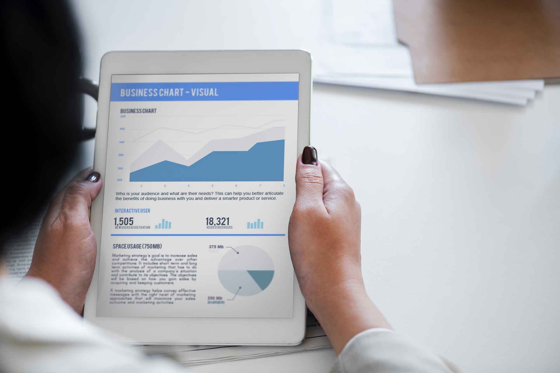
The Google Dashboard really helps understand who's looking at your courses.
Speed Warning
Unfortunately, the dashboard is slow due to pulling data from multiple sources. Currently, there is nothing that can be done about the speed of the dashboard as this is a limitation of Google Data Studio.
Overview of the dashboard
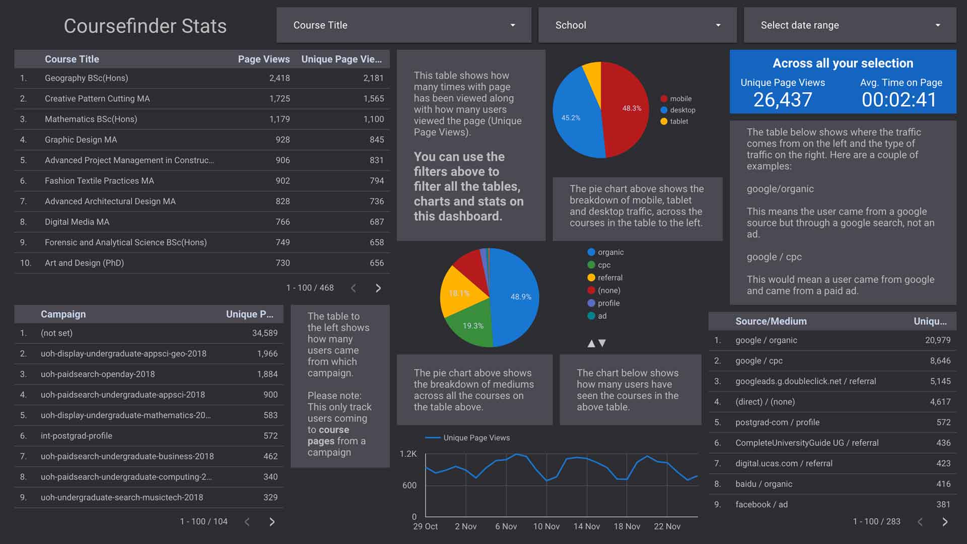
The dashboard contains a selective overview of the statistics for course finder. These include page views, average time on page, campaign data, device breakdowns and where traffic is coming from. In this post, I am going to try and detail what each section means in more detail and how the data may be interpreted.
Data on the dashboard
The dashboard shows data from Google Analytics this data is then matched with course finder data to build a dashboard for each course or groups of courses (i.e. a particular schools courses). The courses shown will only be courses currently on course finder. and won't show any previous years or courses. to get this data, you're best using Google Analytics.
It also only shows data that is collected off campus. So staff and students that are on campus won't be included in the numbers on the dashboard.
What things mean
I want to talk you through all the various elements on the dashboard, what they mean, and how to use and/or interpret them.

Filters
In the top right of the dashboard (the screenshot above this text) shows the different filters that can be applied to the dashboard in order to get the information you want.
Course title
This has a list of all the courses on course finder, this lets you select particular or multiple courses in order to see the statistics for just that course.
School
This filters the dashboard to show only courses that reside within the selected school(s).
Select date range
This lets you choose the time frame of the statistics you want to see on the dashboard. You can select a day, month or range.
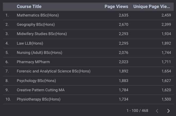
Page views table
The table to the left of the dashboard shows page views and unique page views on a particular course.
Page views
Page views are how many times the page for that particular course has been opened. If a user goes to a page, then returns later than this will count as another page view.
Unique page views
Unique page views are how many times for that particular course has been opened in different sessions (a session lasts 24 hours). This means that if a user comes back to the page after browsing the rest of the website it won't be counted as a unique page view but a regular page view. However, if the user returns a week later and looks at the same page it will be counted as another unique page view.
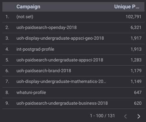
Campaigns
Underneath the page views table, there is a table of the campaigns that have sent traffic to course finder. This would usually be traffic part of different advertising campaigns ran by either central or the schools. The list has a list of the advertising campaigns that have provided traffic to the courses shown in the table above. This should give you an indication of whether a particular advertising campaign is working.
Please note: this only counts for advertising traffic reaching course finder, if you are pointing users towards a landing page and they don't click through to course finder, their unique page view would not be counted in the table. (However, more information about the campaign can be found in Google Analytics)
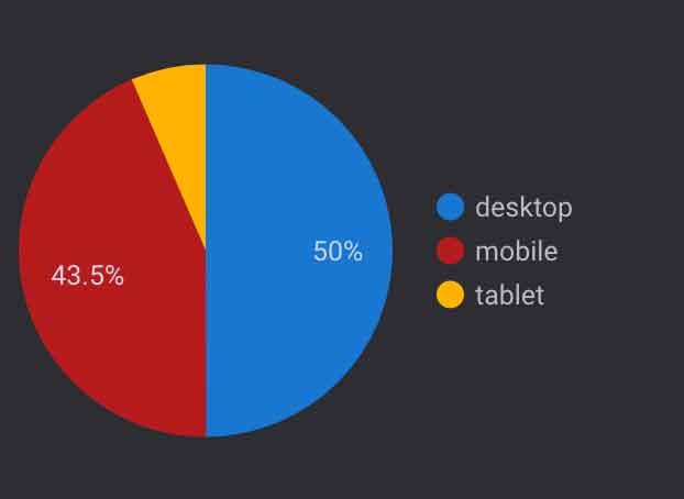
Device breakdown
In the middle of the dashboard, there is a pie chart detailing the different device categories and how many users used that type of device across your filters.
In the example to the right (or below on mobile), you can see the breakdown is 50% desktop, 42.5% mobile and 6.5% tablet. This gives you an indication of how users are viewing your courses, especially across mobile and tablet devices as it makes up around 50% of our traffic to course finder. This may show that more testing of your content on course finder is needed in order for it to be usable on different platforms. This is especially true since most of us use desktop computers at work and never experience course finder on a mobile or tablet device.
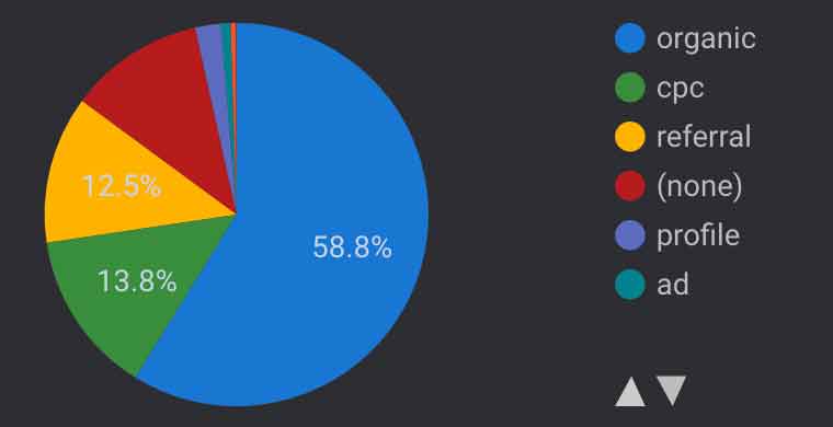
Mediums
These show where users have come from to get to course finder.
This should give you an indication of which source is the most popular among your users.
For instance, you may have a medium of 'cpc' but this may be higher on one course than another. This would show more users are reaching a course through paid advertising on Google than other.
Common Sources
- organic - Users that came via a search (not an ad) this can be from Google, Bing etc.
- cpc - Users that come from an advert within a search engine (usually Google). An example would be a sponsored advert as a top result.
- referral - Users that come from another website such as UCAS, Student Room etc. (This does not include advertising nor or our website).
- (none) - Users that come to our website or course finder by typing the URL directly into the address bar or from a bookmark.
- profile (custom) - Users that have come from an advertising campaign - this is a custom source set by a tracked URL.
- email (custom) - Users that have clicked through to course finder or our site through an email
- ad - Users that have come from an advert (not cpc) this can include Display, Adsense etc.
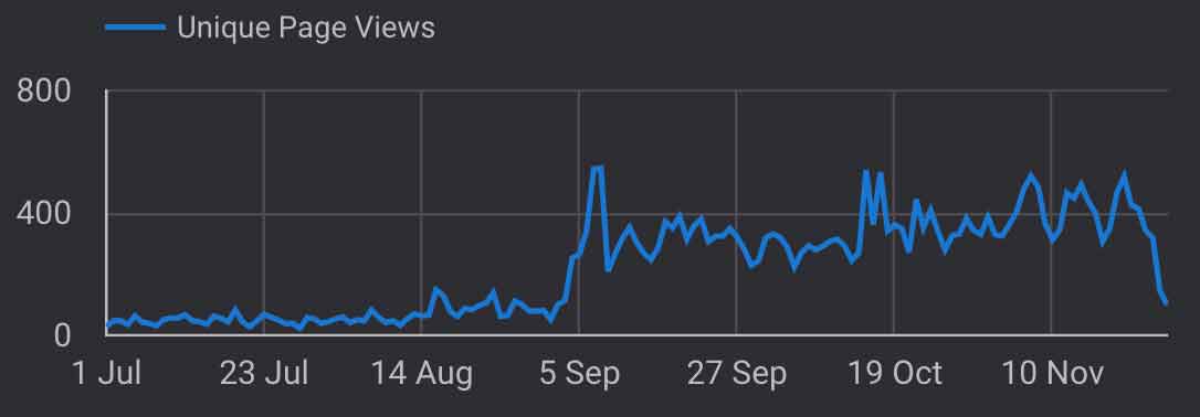
Unique page views
This chart gives an overview of unique page views across all your selected courses and chosen time range. You can hover for more detail.
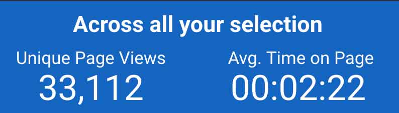
Overview of unique page views and average time on page
This shows the cumulative total of page views and the average time on page across all the courses currently in your selection.
Average time on page
This should give you an indication of whether users are reading the content, as course finder pages tend to be longer pages, this number should allow users to read the whole page. You also need to take into account that this includes users at both end of the spectrum (a user reading the course title and leaving to reading the entire page).
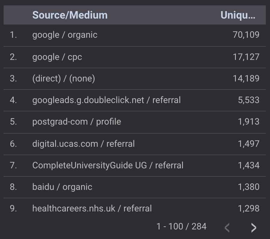
Source/Medium
This table shows where people are coming from similar to the Mediums pie chart although, it includes the source. The source is usually the company/provider (e.g. Google, UCAS etc.) This should give you an idea of how many users are coming from a given source via a particular medium. An example of why this is important is that Google not only would come under the organic medium but the cpc medium too.
Source is the origin of your traffic, such as a search engine (for example, google) or a domain (example.com). Medium is the general category of the source, for example, organic search (organic), cost-per-click paid search (cpc), web referral (referral).
Source/Medium is a dimension that combines the dimensions Source and Medium. Examples of Source/Medium include google/organic, example.com/referral, and newsletterXYZ123/email.
Video Walkthrough
Alongside this post, there is also a video demonstrating how to use the dashboard and goes into more detail on how to interpret the data.
TLDR
- The dashboard is slow there is nothing we can do about this we are limited by Google Data Studio.
- The dashboard provides a vidual representation of the data
- Descriptive boxes surrouding the data to help fully understand which each means