
Responsive Design Mode: preview your webpage on mobile using your PC
James Leah
Front End Web Developer
Ensuring webpages are fully responsive doesn't only improve usability but also helps bring our accessibility score up!
The following will detail how to enter responsive design mode on the most frequently used browsers.
How is this helpful to me?
Browsertesting isn't just necassery for template changes it is also important for ensuring that the content that is being displayed will work on all viewports. Providing a good user experience and also contribututing to improving the accesability score of the site. To find out more about the accessability score of the pages you look after email webteam@hud.ac.uk and request a siteimprove account.
What is responsive design mode?
Responsive design is the practice of designing a website so it looks and works properly on a range of different devices including mobile phones and tablets as well as desktops and laptops.
The most obvious factor here is screen size, but there are other factors as well, including the pixel density of the display and whether it supports touch. Responsive Design Mode gives you a simple way to simulate these factors, to test how your website will look and behave on different devices.
Google Chrome
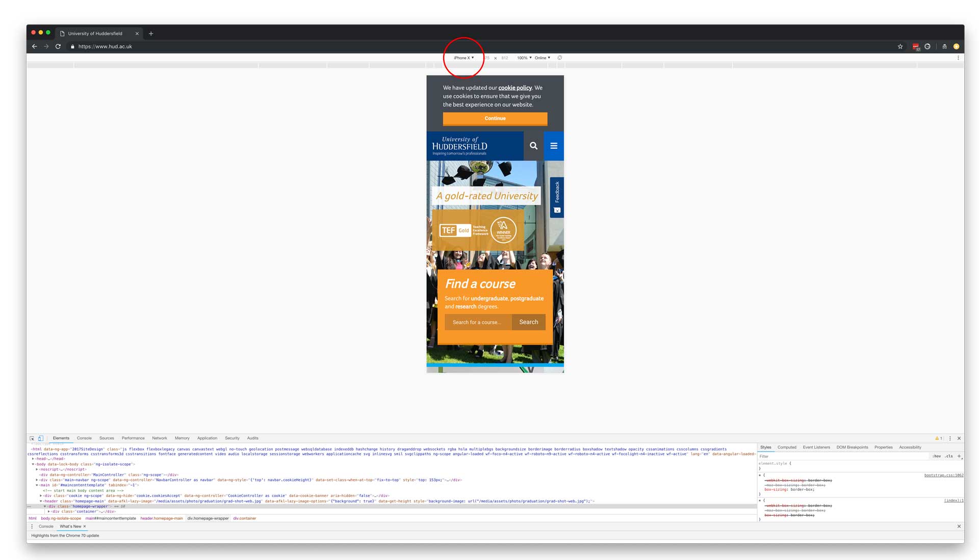
To enable responsive design mode on Google Chrome right click on the page you wish to work on, in the list of options click 'Inspect' (Keyboard shortcut F12). This will open DevTools, DevTools will dock at the bottom of your browser. To the left side of the DevTools bar there is an icon (1.1) which looks like a mobile phone overlapping a tablet, click this button to open the device toolbar(1.2).
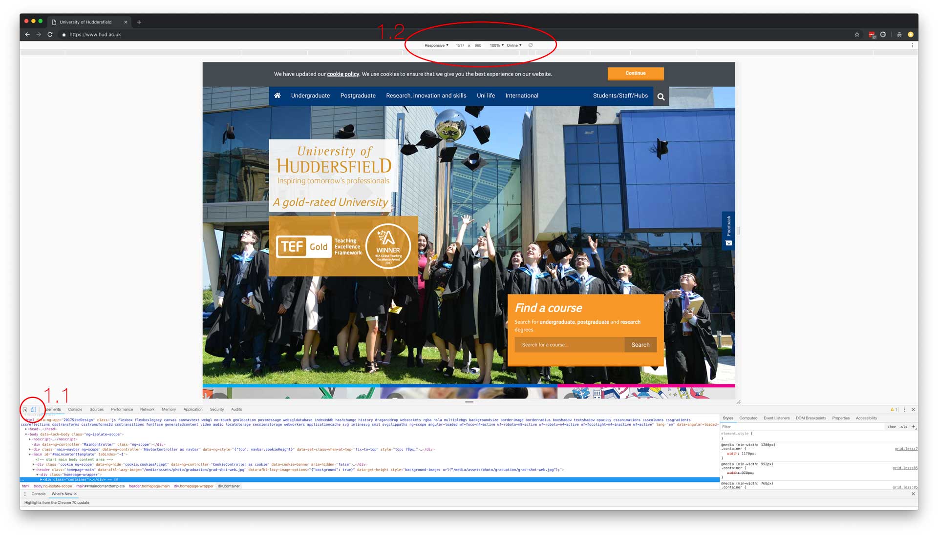
DevTools
Once the device toolbar is open it will default to 'responsive' which will be the current device dimensions, you have the option to click on the 'responsive' button which will provide a range of devices in the form of a list for you to choose. This allows you to previews what the page looks like on that particular device type.
Internet Explorer and Microsoft Edge
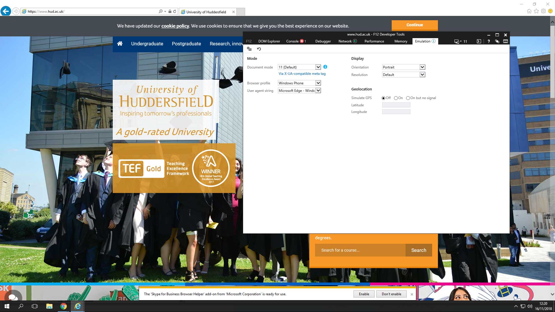
To enable responsive design mode right click on the page you wish to work on, in the list of options click 'Inspect Element'. This will open Developer Tools (Keyboard shortcut F12) which is a pop up window. Click on the 'Emulation' tab which can be seen in figure 2. This feature allows you to switch between legacy versions of Internet Explorer and switch the device that is being used.
Safari
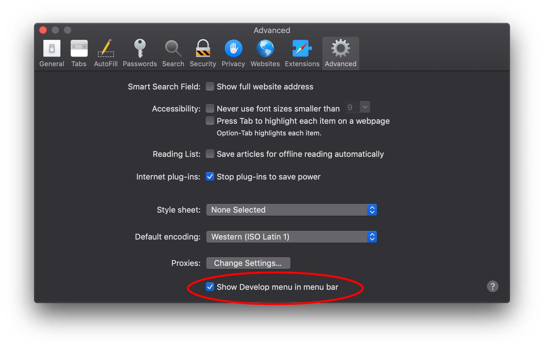
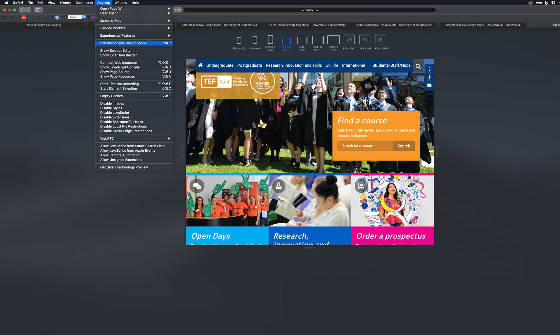
To enable responsive design mode you must first go into Safari's preferences, and go to the advanced tab and check the tickbox at the bottom ' Show Develop menu in menu bar'(figure 3).
To enable responsive design mode go to the browser menu located at the top of the screen, in the list of options choose the newly added 'Develop' option. From the dropdown menu select ' Enter Responsive Design Mode'. As you can see from figure 4 the browser gives you options of different browsers you can test the page on, in the example we are viweing the University homepgae on an iPad mini.
TLDR
- Responsive design is content aswell as template.
- Responsive design means the expereince on all devices should be of the same standard.
- Different browsers have different variations of responsive design mode
- Keyboard shortcut F12 on Windows will enter responsive design mode.