
Best practice for header images
Overview
This post explores how to display hero/header images in the most effective way across devices. We’ll look at why whitespace is critical for readability and design balance, how relying on a single “responsive” image often leads to poor results on mobile, and why providing an alternate, mobile-specific version creates a far better experience.
By the end, you’ll understand:
- Why whitespace makes or breaks a header image.
- The limitations of a one-size-fits-all (responsive) header image.
- How art-directed, device-specific imagery (using techniques like <picture>) ensures your subject and message always look intentional, whether on desktop or mobile.
What size does my header image need to be?
Desktop
All header images for desktop should be of the ratio 16:9, commonly used size on the site is 1920px x 1080px as this works for most desktops larger images can be used to enhance the quality on even larger devices
Mobile (optional)
Header images for mobile should be of the ratio 3:4, a recommended size in pixels would be 1200px × 1600px.
My header is 1920px by 1080px but it's not looking good
Images with not enough whitespace will often appear zoomed in!
Why It Feels Zoomed In
No Breathing Room Around Subject
- If the subject (person, product, object) takes up the whole frame, it feels cramped.
- Whitespace acts like “air” around the subject. Without it, the subject presses right up against the edges, giving a zoomed-in, suffocated feel.
Cropping on Responsive Layouts
- With background-size: cover, browsers crop edges to fill the area of the header.
- If the image has no extra whitespace, the crop cuts directly into the subject and makes it look like you zoomed in on part of the photo.
Why Add Whitespace (a.k.a. “Safe Space”) in Header Images
Avoids Covering Important Content
- If your header image has people, products, or logos, you don’t want your heading sitting right on top of a face or object.
- Adding whitespace (empty background, sky, blurred area, etc.) ensures there’s room for text.
Improves Readability
- Text over a busy or detailed background becomes unreadable.
- By deliberately leaving an uncluttered area, your text/CTA pops.
Gives Flexibility Across Devices
- On mobile, images are cropped tighter.
- If the subject fills the entire image, parts of it may get cut off.
- Whitespace ensures the subject still has breathing room after cropping/resizing.
Design Balance (Negative Space Principle)
- Good header design isn’t just about showing everything.
- Whitespace helps guide the eye toward the subject or CTA.
Best Practice
When designing heading images, leave 30–40% of the image as “empty space” above and below the main parts of the image.
Whitespace vs. Tight Crop: A Side-by-Side Comparison
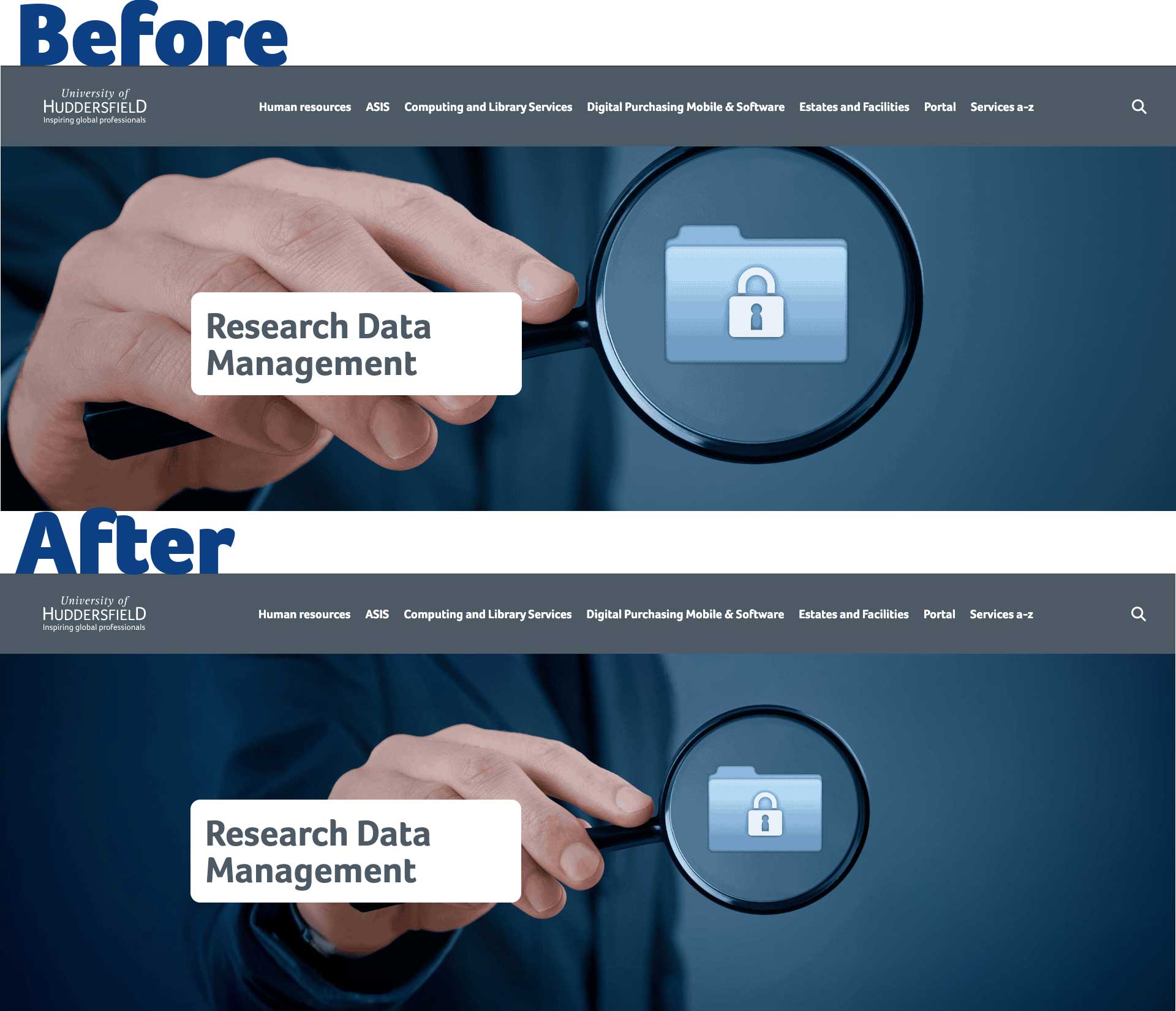
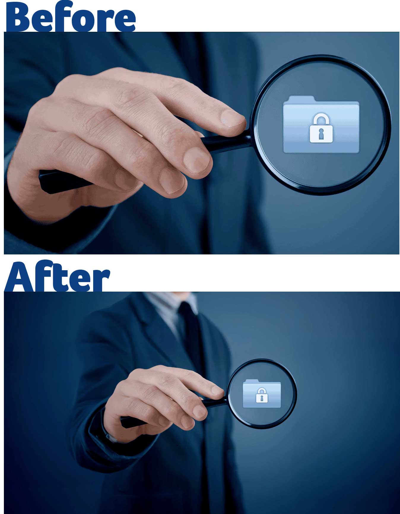
Before
- The magnifying glass and hand are very close to the edges.
- The subject dominates the frame, which makes the design feel zoomed in.
- When scaled or cropped for mobile, parts of the hand or glass are more likely to be cut off.
- There’s little room left for text overlay without covering the main subject.
After
- The magnifying glass and folder icon are centered but surrounded by ample breathing space.
- There’s room above, below, and around the focal point, making the composition feel balanced.
- On responsive screens, this whitespace acts like a buffer, so when the image gets cropped, the key subject is still safe and visible.
- Text overlays (like a headline) could sit comfortably without colliding with the subject.
Takeaway: The first image is better suited for a header because the whitespace provides flexibility across devices and layouts. The second image might look sharp on desktop, but it’s riskier for responsive use since it lacks padding and feels cramped.
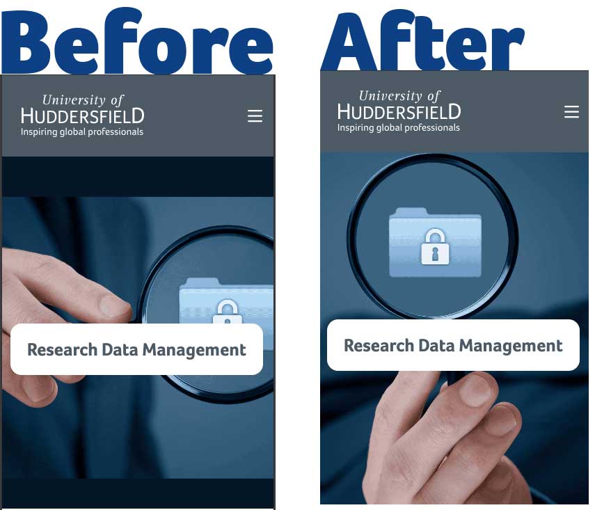
My header looked great on Desktop but its not on Mobile!
In short: your image looks great on desktop because it matches the screen’s shape (16:9), but fails on mobile because the crop doesn’t match the tall portrait shape.
Why It Looks Great on Desktop
- Desktop monitors are wide, 16:9 fits naturally.
- Your full image can show without extreme cropping.
- Subject and whitespace probably sit where you intended.
Why It Fails on Mobile
- Aspect Ratio Mismatch Mobile screens are tall (roughly 3:4 portrait).
- A 16:9 landscape image doesn’t fit, CSS (cover) crops the sides heavily.
- If your subject is centered, it may still be fine, but if it’s off to the side or cut off.
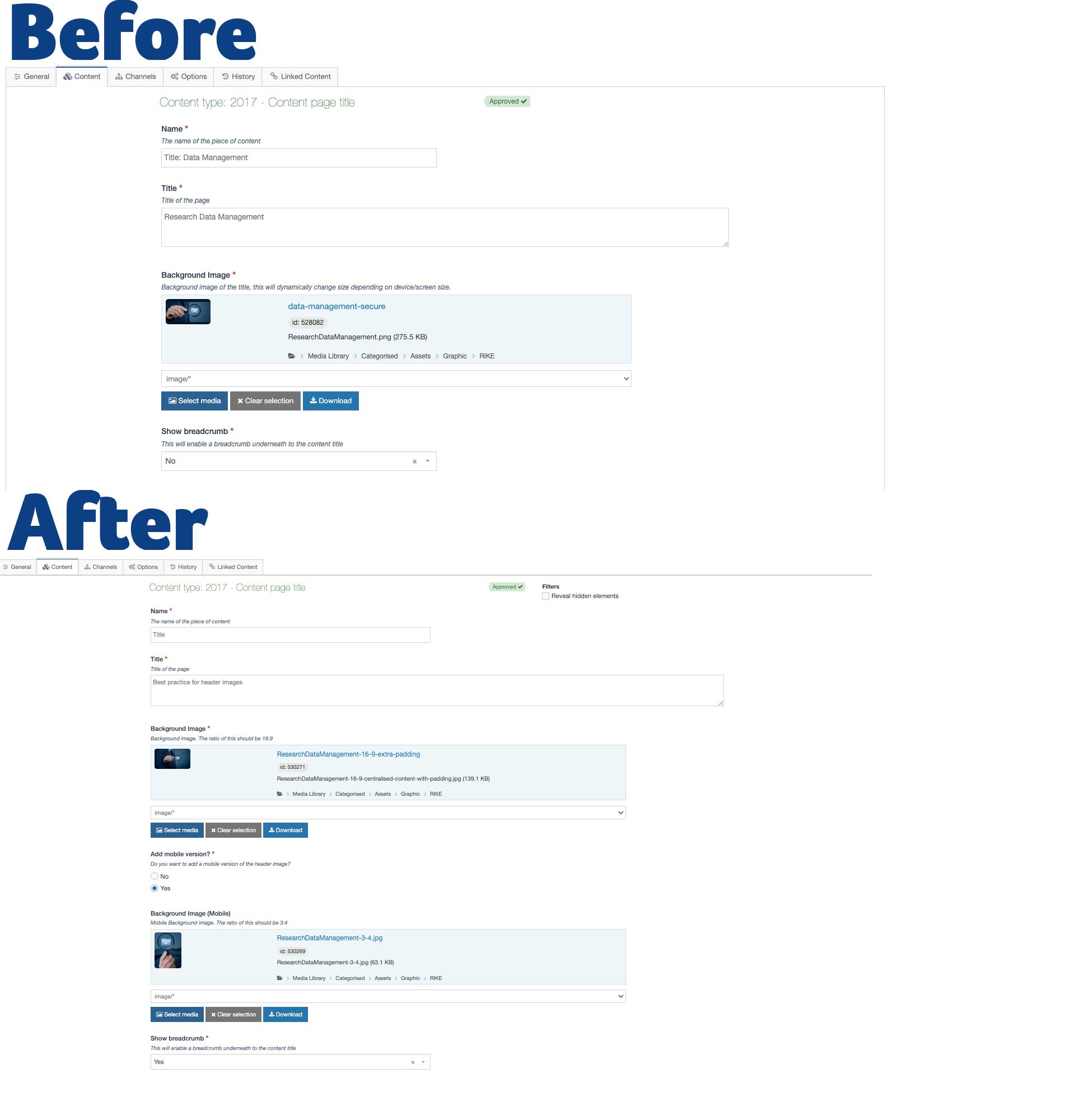
What’s Different When Using the Header Content Type?
The main difference is the addition of an optional mobile image element.
- By default, the header still behaves as before, using the desktop image and scaling it responsively.
- But now, if you want to ensure your subject displays correctly on smaller, portrait-oriented screens, you can provide a separate mobile-specific image.
This allows you to:
- Use a different aspect ratio (e.g., 3:4 for mobile instead of 16:9).
- Adjust the composition so that key subjects remain visible.
- Ensure whitespace and balance are preserved, even when cropped differently.
Example
In the demo shown, the magnifying glass image has been slightly rotated in the mobile version. This ensures it is fully visible within the frame, instead of being cut off by the narrower viewport.

James Leah
Web Development Manager
Whitespace: The Secret Ingredient of Perfect Header Images
Back to the WebTeam blog
Find other useful posts from the WEB / DCT team
Discover other T4 tips
Find other useful tips!